
The River (1951)
First, let's just make it clear that I do love the Motion Picture Academy.
Or I love what the Academy is supposedly supposed to aspire to. That, I love.
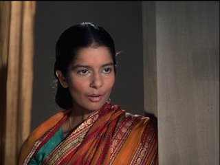
I saw, on Wednesday, for the 2nd time in my life, Jean Renoir's coming of age story, "The River" (1951), based on the novel by Rumer Godden. Godden also wrote the novel "Black Narcissus".
 My 1st viewing of "The River" was in London, on New Year's Day, 2005, on my honeymoon. My wife and I went to the screening of a newly restored version of the film that the National Film Theatre was introducing as part of its "India Vu Par" series. I count it as one of the fine filmgoing experiences of my life - taking my new wife to that cinema Mecca beside The Thames, where I had sat alone on my visits to the UK, in the 90's and in the 80's, watching "Dr. Zhivago", watching "The Pillow Book", watching "The Last House On The Left" (or was it "The Hills Have Eyes"?), browsing before and after the tables of used books out front, or sitting by the river writing an over-romantic letter to whoever I was dating, waiting for the screening to start, or gushing to the poor girl all about a film I just saw that she couldn't care less about.
The print my wife and I saw - a print struck in England by the BFI, I think (if anyone knows for sure, please tell me) - was beautiful, the color remarkable, stunning. "The River" is famous for being one of the greatest examples of Technicolor photography ever, and after seeing that print on New Year's Day, I began to understand why.
Having seen "The River" this 2nd time, I can feel the film climbing toward the upper reaches of my favorite films list.
The Academy of Motion Picture Arts & Sciences film restoration program, however, is plummeting toward the lower reaches of my favorite restoration program's list.
Despite my love for the filmmaking, throughout the screening on Wednesday, a loud voice kept shouting through my head: "This looks like crap. This looks like crap. This looks like crap."
"No, it doesn't," I would reply to myself.
"Oh, yes, it does," I would reply to my reply to myself, "Utter crap ..."
Mike "Pogo" Pogorzelski, director of the Academy Film Archive, introduced "The River" saying that an attempt was made to make the film appear exactly as it would have in 1951.
To me, the print - though clearly new and utterly free of scratches and tears - looked grainy, muddy, high contrast.
So what happened?
One possibility is that I don't know what I'm talking about. But we know that this is the risk you take whenever you read the rabbit + crow blog.
The 2nd possibility is that the cinematography of "The River" is embarrassingly overrated. Critics raved about it in 1951. Critics still rave about it. Martin Scorsese raves about it. But maybe the eyes of those fanatics are color-blinded by their love of Renoir. Yes, the direction is impeccable, the shots perfectly composed, the lighting superb - but color is not something that seems remarkable to me in that movie - my opinion based solely on Wednesday night's screening. Oh, I suppose you could sit me down and explain to me - educate me to - the merits of "The River's" color photography. Yes, I could be convinced. My palate could be trained, I suppose. I may just be a philistine who doesn't appreciate good color. If that's the case, I'm willing to learn.
The 3rd possibity is that the Academy's print was sub-par - which brings up the question of whether or not the whole 2004 restoration was flawed. This restoration was a joint effort between the Academy and the British Film Institute. The original sound elements were missing, but the sound was (and very nicely too!) restored from a complete print owned by young gotham indy helmer Martin Scorsese. The original Technicolor nitrate camera negatives were still intact however, and one of the great things about black-and-white nitrate negatives is if they don't deteriorate, then they will stay in very good condition. It's all-or-nothing with nitrate. Theoretically, it should be possible to make a perfect print - like new - from these original negatives. However, we do not have Technicolor labs anymore, expert in the dye-transfer process, and so no print made today is going to look like a 1951 Technicolor print made with the original dye-transfer process. For one, dye-transfer, unlike the standard optical, photographic process - produces a print free of grain. No grain. Nope. Grain, nyet. You forget that you're looking at film. Seeing a great dye-transfer Technicolor print is like looking through a magic window into a yummy color world where flesh-tones look so real you just want to pinch the actors' cheeks. On Wednesday, if I had the urge to pinch the actors' cheeks, I would have paused, for fear of scraping myself on the sandpaper-like grain of the film.
But its graininess aside, the print's color was murky. Not "muted". I have no problem with muted. It was murky. Lots of brown. A montage of flowering trees denoting the start of spring probably elicited gasps in 1951. I'm thinking the most it got out of the crowd on Wednesday was the fleeting thought: "What gorgeous trees! I bet they would be really pretty and colorful in real life!" Technicolor uses a 3-color process, often with a 4th keytone strip of graytones to modulate the color - exactly like Photoshop's CMYK. Each element - the C, the M, the Y, and the K - is stored on its own strip of black-and-white film, then all four are, in effect, sandwiched together (sort of), to create the final image. The Academy's "The River" print looked as if someone at the lab had gone hog-wild with the black-and-white keytone strip - or as if some drug addict had sneaked in and said "Man, this color freaks me out! Turn down the color, maaaan!!!" It did give the print an "old-fashioned" look, so I guess that's one plus. You know, like when you order a special sepia-tone on your family photos to make them look all antiquey? Maybe Renoir was going for an antiquey, old-fashioned look.
Or maybe India is just an antiquey, old-fashioned looking country. That's probably it. It's India. I'm going to blame it on India. They probably didn't have as much color as we did back then because they were so poor.
So why was the NFT print so much better than the Academy's print? Better labs in England than Los Angeles? Possible. Was I seeing the film through honeymoon-colored glasses? Possible. Was the NFT's screening room much smaller than the Academy's massive Samuel Goldwyn Theater and so able to provide a more concentrated image on the screen? Very possible.
It seems only natural to compare "The River" and "Black Narcissus", two Technicolor masterpieces, based on books by Rumer Godden about sexual awakening and the mixing of cultures, both featuring Esmond Knight. I was similarly disappointed with the Academy's "Black Narcissus" print. And that hurts. Yes. Like the cobra's bite, it hurts. For I am very fond of both films. And I want them treated with reverence. Yes, reverence. Reverence.
 But what I really want is to see a digital restoration of "The River" - like the recent "Singin' in the Rain" restoration. The Academy is dedicated soley to photographic restoration of films, which is a key component of preservation of the actual film materials and is vital in keeping the films around for the long, long term, and so a great digital restoration is outside their mandate. And "The River" money has been spent. That's it. No more restorations of "The River". It's had it's turn. I am told the DVD transfer of the film is very, very good however.
Okay, here's what I really, really want: a full-scale, completely working, manned with genius technicians, 3-strip Technicolor dye-transfer-only facility that makes perfect restorations of technicolor prints on some kind of perfect nitrate stock that doesn't explode. Please? It will only cost a few hundred million dollars or so, and it will make me very happy. And I think it will also make Jean Renoir very happy.
Or I love what the Academy is supposedly supposed to aspire to. That, I love.
I saw, on Wednesday, for the 2nd time in my life, Jean Renoir's coming of age story, "The River" (1951), based on the novel by Rumer Godden. Godden also wrote the novel "Black Narcissus".
 My 1st viewing of "The River" was in London, on New Year's Day, 2005, on my honeymoon. My wife and I went to the screening of a newly restored version of the film that the National Film Theatre was introducing as part of its "India Vu Par" series. I count it as one of the fine filmgoing experiences of my life - taking my new wife to that cinema Mecca beside The Thames, where I had sat alone on my visits to the UK, in the 90's and in the 80's, watching "Dr. Zhivago", watching "The Pillow Book", watching "The Last House On The Left" (or was it "The Hills Have Eyes"?), browsing before and after the tables of used books out front, or sitting by the river writing an over-romantic letter to whoever I was dating, waiting for the screening to start, or gushing to the poor girl all about a film I just saw that she couldn't care less about.
The print my wife and I saw - a print struck in England by the BFI, I think (if anyone knows for sure, please tell me) - was beautiful, the color remarkable, stunning. "The River" is famous for being one of the greatest examples of Technicolor photography ever, and after seeing that print on New Year's Day, I began to understand why.
Having seen "The River" this 2nd time, I can feel the film climbing toward the upper reaches of my favorite films list.
The Academy of Motion Picture Arts & Sciences film restoration program, however, is plummeting toward the lower reaches of my favorite restoration program's list.
Despite my love for the filmmaking, throughout the screening on Wednesday, a loud voice kept shouting through my head: "This looks like crap. This looks like crap. This looks like crap."
"No, it doesn't," I would reply to myself.
"Oh, yes, it does," I would reply to my reply to myself, "Utter crap ..."
Mike "Pogo" Pogorzelski, director of the Academy Film Archive, introduced "The River" saying that an attempt was made to make the film appear exactly as it would have in 1951.
To me, the print - though clearly new and utterly free of scratches and tears - looked grainy, muddy, high contrast.
So what happened?
One possibility is that I don't know what I'm talking about. But we know that this is the risk you take whenever you read the rabbit + crow blog.
The 2nd possibility is that the cinematography of "The River" is embarrassingly overrated. Critics raved about it in 1951. Critics still rave about it. Martin Scorsese raves about it. But maybe the eyes of those fanatics are color-blinded by their love of Renoir. Yes, the direction is impeccable, the shots perfectly composed, the lighting superb - but color is not something that seems remarkable to me in that movie - my opinion based solely on Wednesday night's screening. Oh, I suppose you could sit me down and explain to me - educate me to - the merits of "The River's" color photography. Yes, I could be convinced. My palate could be trained, I suppose. I may just be a philistine who doesn't appreciate good color. If that's the case, I'm willing to learn.
The 3rd possibity is that the Academy's print was sub-par - which brings up the question of whether or not the whole 2004 restoration was flawed. This restoration was a joint effort between the Academy and the British Film Institute. The original sound elements were missing, but the sound was (and very nicely too!) restored from a complete print owned by young gotham indy helmer Martin Scorsese. The original Technicolor nitrate camera negatives were still intact however, and one of the great things about black-and-white nitrate negatives is if they don't deteriorate, then they will stay in very good condition. It's all-or-nothing with nitrate. Theoretically, it should be possible to make a perfect print - like new - from these original negatives. However, we do not have Technicolor labs anymore, expert in the dye-transfer process, and so no print made today is going to look like a 1951 Technicolor print made with the original dye-transfer process. For one, dye-transfer, unlike the standard optical, photographic process - produces a print free of grain. No grain. Nope. Grain, nyet. You forget that you're looking at film. Seeing a great dye-transfer Technicolor print is like looking through a magic window into a yummy color world where flesh-tones look so real you just want to pinch the actors' cheeks. On Wednesday, if I had the urge to pinch the actors' cheeks, I would have paused, for fear of scraping myself on the sandpaper-like grain of the film.
But its graininess aside, the print's color was murky. Not "muted". I have no problem with muted. It was murky. Lots of brown. A montage of flowering trees denoting the start of spring probably elicited gasps in 1951. I'm thinking the most it got out of the crowd on Wednesday was the fleeting thought: "What gorgeous trees! I bet they would be really pretty and colorful in real life!" Technicolor uses a 3-color process, often with a 4th keytone strip of graytones to modulate the color - exactly like Photoshop's CMYK. Each element - the C, the M, the Y, and the K - is stored on its own strip of black-and-white film, then all four are, in effect, sandwiched together (sort of), to create the final image. The Academy's "The River" print looked as if someone at the lab had gone hog-wild with the black-and-white keytone strip - or as if some drug addict had sneaked in and said "Man, this color freaks me out! Turn down the color, maaaan!!!" It did give the print an "old-fashioned" look, so I guess that's one plus. You know, like when you order a special sepia-tone on your family photos to make them look all antiquey? Maybe Renoir was going for an antiquey, old-fashioned look.
Or maybe India is just an antiquey, old-fashioned looking country. That's probably it. It's India. I'm going to blame it on India. They probably didn't have as much color as we did back then because they were so poor.
So why was the NFT print so much better than the Academy's print? Better labs in England than Los Angeles? Possible. Was I seeing the film through honeymoon-colored glasses? Possible. Was the NFT's screening room much smaller than the Academy's massive Samuel Goldwyn Theater and so able to provide a more concentrated image on the screen? Very possible.
It seems only natural to compare "The River" and "Black Narcissus", two Technicolor masterpieces, based on books by Rumer Godden about sexual awakening and the mixing of cultures, both featuring Esmond Knight. I was similarly disappointed with the Academy's "Black Narcissus" print. And that hurts. Yes. Like the cobra's bite, it hurts. For I am very fond of both films. And I want them treated with reverence. Yes, reverence. Reverence.
 But what I really want is to see a digital restoration of "The River" - like the recent "Singin' in the Rain" restoration. The Academy is dedicated soley to photographic restoration of films, which is a key component of preservation of the actual film materials and is vital in keeping the films around for the long, long term, and so a great digital restoration is outside their mandate. And "The River" money has been spent. That's it. No more restorations of "The River". It's had it's turn. I am told the DVD transfer of the film is very, very good however.
Okay, here's what I really, really want: a full-scale, completely working, manned with genius technicians, 3-strip Technicolor dye-transfer-only facility that makes perfect restorations of technicolor prints on some kind of perfect nitrate stock that doesn't explode. Please? It will only cost a few hundred million dollars or so, and it will make me very happy. And I think it will also make Jean Renoir very happy.
Labels: movies
posted at 10:29 PM - permalink
![]()
![]()


